Thursday, 31 March 2011

And I forgot to Say...


My Business cards arrived (very exciting)... 


and


with some advice, I have decided to print my final 9 EMP images onto a type of double laminated foamboard. As I stated previously, I definitely don't want the photographs framed, and by using this method of printing, it keeps the images looking contemporary.(I just need to ensure that the corners don't get bent)... It also gives me the flexibility when arranging the images as I haven't decided on the layout yet; I may position the photos together to create a panoramic landscape as I won't have any heavy frames dividing up the image. Moreover, I may decide to display all the photos separately anyway?


My only concern is that the foamboard is too thin a material- and therefore, the images will be too flat against the wall when exhibited. Ideally, I would like the images to be printed on something with a depth of a couple of centimeters. So, on that basis, some more research will need to be undertaken in regards to various foamboards and their properties! However, at present, I am content with the idea of having 9 images on a foam like material...


Anyway, the printing is courtesy of a company called FLUX, based in Boscombe, Dorset. 


And on a completely random, off topic note:


I really like the Google logo/image today. 


I think it's really clever and interesting. I am always amazed at how one can combine/position objects together to create another image; or in this case, alphabetical characters. Big up to the Google! 


Runner Bean Update:

As promised, here is a photographic update of the runner bean seeds that I planted in varying conditions.


The above photographs show the seed that had normal conditions; access to normal light, water and stored at room temperature.


These photos show the seed that was kept at room temperature although in complete darkness. I was surprised with the amount that the seed actually developed considering its limited conditions.


This been seed was in the fridge. Once again, I was surprised that there had been any changes due to the cold conditions...

I'd never have thought that nature could be so resistant to such unnatural conditions. An interesting experiment that has caused some interesting results...


Sunday, 27 March 2011

No need for an official title today...

First things first, George the plant has officially died and therefore is no more. (He has however been wrapped in cling film for the past few weeks, so not really that surprising)... Secondly, some more exciting news; some of the Runner Bean seeds have started to sprout and grow roots. Even the ones with fairly limited light and even less oxygen! (Photo updates to follow shortly).


However, back to the research and reference material for my EMP...


I have found a very interesting contemporary photographer called 
Paul Raphaelson.


He is an American artist born in NYC,(1968) best known for his urban landscape photography. 
After moving to Rhode Island, he began producing often dark, complex images depicting urban, suburban and industrial landscapes. 


His work is said to blur the lines between classical formal modernism and the politically aware NEW TOPOGRAPHICS photography from the 1970s. 


I really like his photographs as they are not pretty images. I like the fact that they are 'hard core' urban landscapes, showing scenes that ordinarily may have been ignored if not for Raphaelson's photography. I like the combination of road signs, text (in the first image), greenery etc. His work is also relevant to my EMP as once again, it depicts how nature and greenery is restricted within urban locations.


Thursday, 24 March 2011

George Shaw

George Shaw is another artist that I feel is relevant to mention in regards to my work. He is a contemporary artist from Coventry, whom is noted for his highly detailed naturalistic approach as well as his English suburban subject matter. Interestingly, Shaw's preferred method of working is with mini enamel paints; much like those used to paint toy models.


He first attracted attention for painting the estate in which he grew up in the 1970s; The Tile Hill suburb of Coventry.


Once again, I feel Shaw's work supports my work/ photographs from the Negotiated Practice Unit as I focussed on Urban landscapes, high rise buildings and council estates. The main difference between us is methodology rather than the subject matter.


The images above are just a couple of examples of Shaw's enamel landscapes.


(Just  a reminder of one of the photographs used for the negotiated practice)

Update Alert.

So, for the moment I think things are progressing relatively smoothly.


1.I got an interview for Watford! Wayhaaaaaaay...


AND

2. I think the photos I have been working on will work well for my EMP final Piece.


3. I just ordered my first set of business cards. (And hence I am feeling rather old and fairly grown up)...


I just need to remember to stay calm, prioritize and make sure I do my research for the interview. 


Although I am pleased with the outcomes of my photos, I need to decide how best to exhibit them for the end of year show. I know that I don't want the images framed and I know that I want them to have a matte finish rather than glossy. I am no longer considering the option of fabric as I don't want the images to loose the photographic quality that thick Cartridge paper offers. However, my issue is having them displayed forward from the wall- ie. not flush.


I have also decided on reflection and with the aid of a tutorial, that I will no longer embroider and sew into the images- I am going to leave them as they are; especially as when viewed together, they create an interesting panoramic landscape. 


The photographs above are from my more recent photographic explorations!

 And once again, all the photos are my own; I hope you like them. 

Interestingly, in my last tutorial, a reference to the English artist John Constable was made- especially in terms of hues; colour palette and tone. 

The images below are actually some examples of Constable's work.


He was an English Romantic painter whom was born in Suffolk. He is known principally for his landscape paintings of Dedham Vale, the area surrounding his home—now known as "Constable Country"—which he invested with an intensity of affection. "I should paint my own places best", he wrote to his friend John Fisher in 1821, "painting is but another word for feeling".

I find it quite ironic that Constable was mentioned as a comparison to my work as I have visited Flatford Mill in the past. Flatford Mill is a rural place, surrounded in thick woods, wildlife and beautiful views; It is also referenced in several of Constable's paintings. I also find the Constable reference interesting as he painted the good ol' English countryside as it was back in the 18th and 19th Centuries; Where in comparison, I am highlighting the fact that we are destroying/ restricting our natural habitats with over building and populating 200 years later. 

The image below shows Constable's The Haywain; one of his most famous paintings. Flatford Mill can be seen on the left hand side.


The image below shows The Mill as it is today- located in Suffolk.


Friday, 18 March 2011

Megan Wilson

Megan Wilson is a visual artist based out of San Francisco. She creates large-scale installations that incorporate traditional crafts and decoration. Wilson explores the meaning and value of “home;” Buddhist principles of impermanence and generosity; beauty and ornamentation; feminism; and the intersections between art/life/architecture/design. Her public projects explore and challenge socio-political structures and their impact on community and culture. Once again, I found Wilson's work to be inspiring and relevant to my EMP; especially as she uses such a unique technique to create her work. She also has an interest in the environment, communities and architecture, which too supports my brief on Environmental Restrictions and how we are impacting on our environment.


Wilson is inspired by patterns and textiles and the relationship between evolution and structured environments as well as the decline in organic nature.

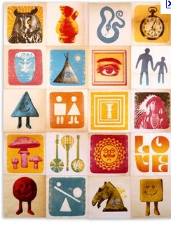
Steve Harrington- Illustrator:

Steve Harrington is one illustrator that has really caught my eye recently. I love his simple, yet effective imagery.


When asked what inspires him to create, he replied:

'The whole of everything together at once, the Congos, Planet Earth, You...'


He lives and works in Los Angeles, CA. Influenced by Time Life encyclopedias from 1965 through 1972, second hand stores and the '60s psych sounds of The Moody Blues. Each piece of his work is created as a tangible object symbiotically defined of a larger context. His work is often self-inspired. Harrington also creates work for the National Forest Design with fellow artist Justin Krietemeyer. So not only do I like and admire his illustrations, the fact that he supports the National Forest Design, works alongside my EMP campaign on how we are restricting our environment. Sorted!